The Plan..... We had been studying how to turn data into pie charts or "percent circles." I had planned to have students take some data, add it into Google Sheets, create a pie chart, save their chart as an image, and create a Thinglink to add "tags" to the slices of the pie chart. The Data and Chart... Our community is home to The University of Iowa. With it being NCAA basketball season, we decided to use some statistics from theIowa men's basketball team. 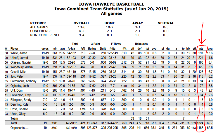 We started by looking at the total points scored by each player on the team. We took the data and put it into a Google Sheet. 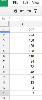 After the data was recorded in the Google Sheet, it was highlighted. After being highlighted, we clicked insert and chart. 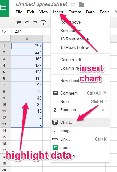 After selecting to insert chart, we selected "charts" and then we were able to choose "pie chart." 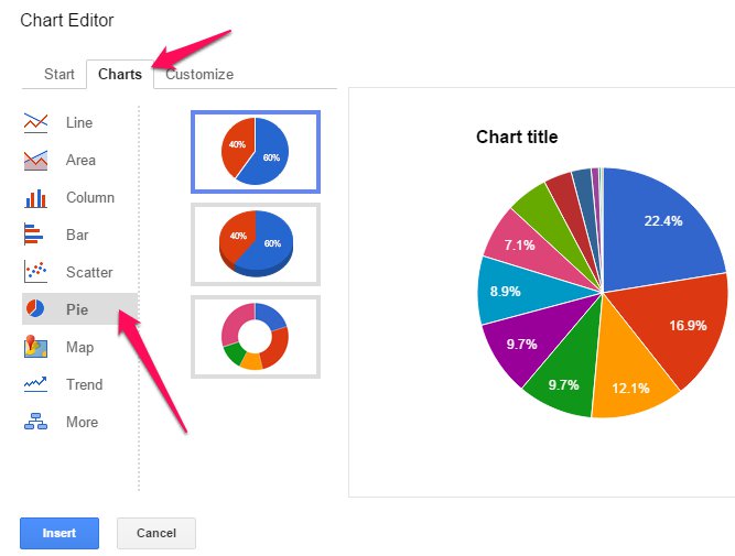 After the chart was chosen, we then clicked insert to get it into the Google Sheet. At this time, we took a screen shot of the pie chart. We saved the screen shot to our desktop for easy access. 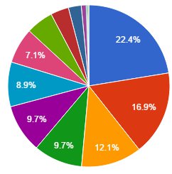 Thinglink... After our pie charts were saved to our desktops, we navigated to Thinglink. After signing into Thinglink, we clicked "create" to begin adding tags to our pie chart. 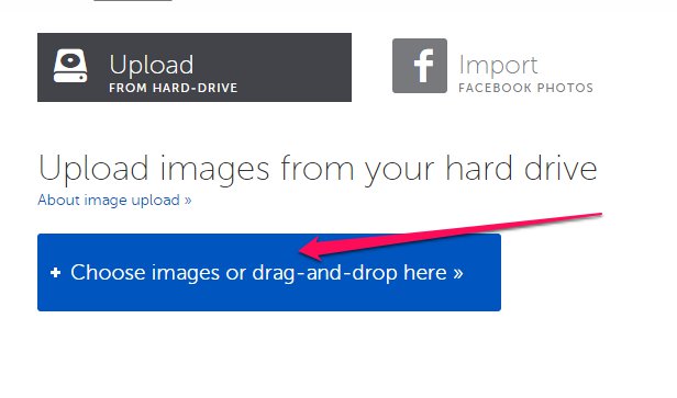 We chose to upload images. Students would select the image from their desktop. Once loaded in Thinglink, we gave our picture a title and added our first "tag." 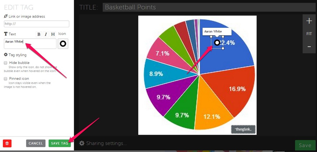 Students used the stats of the men's basketball team to correctly name the tags. Each tag was supposed to contain the name of the player who had scored that percent of the total points. This process was repeated for all slices in our pie chart. Upon completing their interactive image, they clicked share and copied the embed code. This embed code was then added to their Kidblog to share. The next step of this process was to look at more statistics from the men's basketball team. Take away... We could have done this same process using the provided data from the curriculum. However, to make this a more authentic experience, we chose to utilize some of the local information we had available. Students were able to make a connection with the data and knew almost all of the players. It was a fun way to practice pie charts in an authentic way. Share This:
1 Comment
|
Andrew FenstermakerInstructional Technology Coordinator | Innovation Coach | Google Certified Innovator | Presenter | Blogger | Adjunct @UiowaEducation | Owner @kids_f_i_r_s_t 


|
 RSS Feed
